
I worked with my team to build a protein-protein interaction (PPI) favourability predictor using two very different kinds of protein embeddings — one derived from amino-acid sequence, one derived from network/co-occurrence structure — and then spent more time figuring out why one beat the other. This post walks through the project, but the part I actually want to talk about is the explainability work I implemented: how I went from "network embeddings get a higher ROC-AUC" to a defensible, evidence-backed account of what the model learned and why.
The Setup
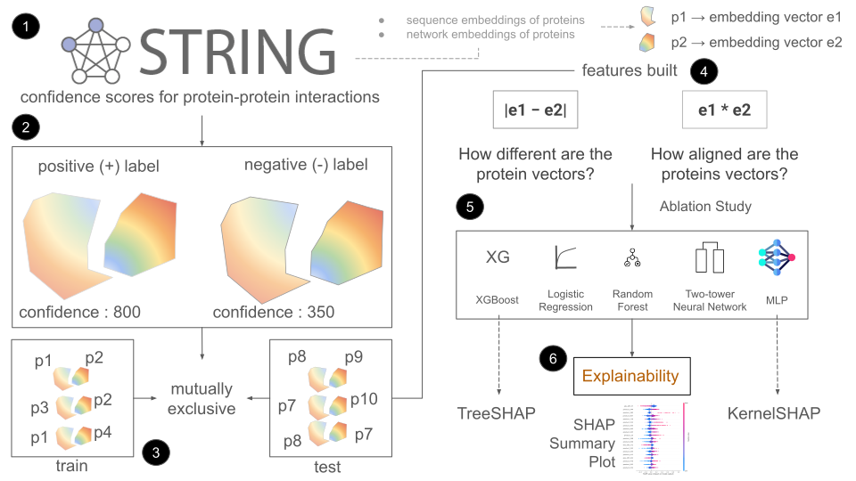
The task is binary: given two human proteins, predict whether they interact. Ground truth comes from STRING's combined confidence scores. A major challenge in PPI favourabilty prediction is to create negative examples. STRING gives protein pairs that interact at some level, but it doens't give a list of proteins that do not interact.
So how do you tell the model what proteins won't interact favourably?
How about swapping protein pairs ? (A-B), (C-D) [positives] => (A-C), (B-D) [negatives]
These negatives are too easy, weak biological signal so nothing for the model to learn the difference between highly favourable and less favourable interactions.
We changed negatives to medium-confidence pairs (300-500) as compared to high confidence positive pairs (≥ 800). This makes the task harder and more realistic: the model has to separate true interactions from plausible-but-unfavourable ones, not just from obvious non-pairs.
Every protein has two embedding representations available:
- Sequence embeddings — derived from the amino-acid sequence itself.
- Network embeddings — derived from the STRING interaction graph structure.
For any pair, we built features as the concatenation of |e1 − e2|
(how different the two proteins are) and e1 * e2
(shared/aligned directions in embedding space) — done separately for each
embedding type, then optionally combined.
The Headline Result
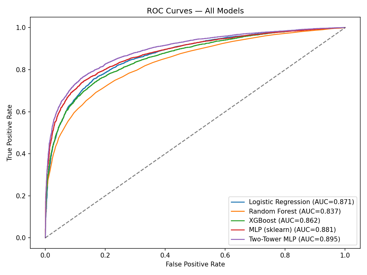
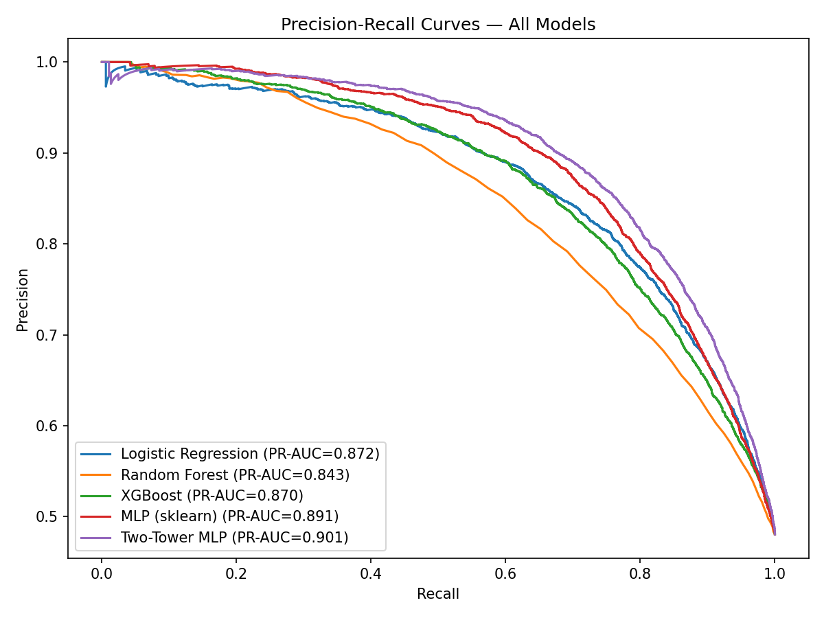
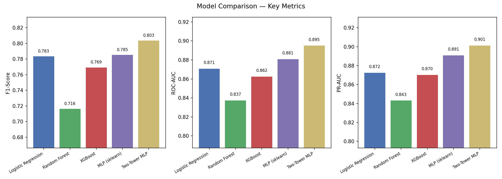
Across every architecture we tried — a plain MLP, logistic regression, random forest, XGBoost, and a custom two-tower neural network — the same pattern held: network embeddings consistently outperformed sequence embeddings, and combining both gave only a marginal lift over network alone. That result was consistent enough, across enough model families, that it stopped looking like noise and started looking like something real about the data.
That raised the obvious question, and the one this post is really about: why?
Why do the network embeddings perform much better than sequence embeddings ?
Explaining the Gap: Embedding Geometry
The first place I looked was the geometry of the embedding spaces themselves, independent of any classifier. For every test pair, I measured cosine similarity and L2 distance between the two proteins' embeddings, split by whether the pair actually interacts.
The intuition: if a classifier can separate interacting from non-interacting pairs, the embedding space should already show some separation along simple geometric measures, before any model is trained on top of it. Network embeddings showed a noticeably larger gap in cosine similarity between interacting and non-interacting pairs than sequence embeddings did — interacting proteins sit measurably closer together in network-embedding space than non-interacting ones, more so than in sequence space.
Do interacting proteins share neighborhoods?
I also checked k-nearest-neighbor overlap in network-embedding space: for each pair, how many of their top-10 nearest neighbors do they share? Interacting pairs showed higher neighborhood overlap than non-interacting pairs — consistent with the network embedding space capturing functional modules or pathway co-membership, not just raw similarity.
How concentrated is each space?
Network embeddings explain 62.4% of the data within 20 principal components as compared to 54.7% of the data explained by sequence embeddings. A more concentrated variance indicates a more structured, lower-intrinsic-dimension space — easier for downstream classifiers.
Explaining the Model: Feature Attribution
Geometry explains the embeddings; it doesn't explain the classifier. For that I used two complementary feature-attribution approaches:
-
KernelSHAP on the MLP —
model-agnostic, slower, run on a sample of test pairs against a background sample. - TreeSHAP on an XGBoost model trained on the same features — exact and fast, used as a cross-check against the KernelSHAP results.
The below code runs KernelSHAP. It "masks" a feature by replacing it with the average value of that feature to perturb the data and get inference from the model.
[Python3]explainer = shap.KernelExplainer(predict_fn,X_train,link="identity")The input features assessed were |e₁ − e₂| (difference) and e₁ ⊙ e₂ (product), the Mean SHAP value returned is compared and the larger SHAP values conveys which feature is more important, since it indicates that the feature, on average, causes a larger change in the model's prediction.
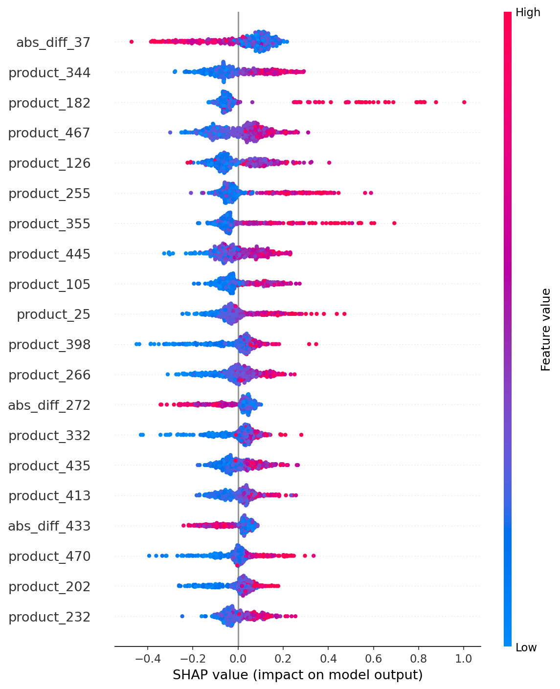
The single highest-ranked feature was an absolute difference dimension, but 9 of the top 10 most important features were element-wise product dimensions, suggesting that the model relies heavily on the shared directional structure between protein embeddings.
Example predictions
| Protein 1 | Protein 2 | Confidence prediction |
|---|---|---|
| RPL8 | RPL4 | 1.0 |
| RPL4 | RPS16 | 1.0 |
RPL8, RPL4 & RPS16 are proteins found in the ribosome that have favourable interactions. (Similar research finding : Zou et al. 2020)
The biggest lesson from this project wasn't about model architecture — it was that a single metric ("network beats sequence by X points of AUC") is a starting point, not an answer. Getting to an actual explanation took geometry analysis and feature attribution from two independent methods — and only because all of them agreed did I trust the conclusion.
AI Use Summary: I used Claude (Sonnet 4.6) LLM to assist me in refining the writeup of this document. The project was entirely done my ML team and me.